How to read a meteogram
A meteogram is a time-series forecast for one location — it tells you what the weather at an airfield looks like hour by hour for the next 2–5 days. ClearToFly's meteograms are optimised for VFR go/no-go decisions.

Navigating the forecast
The meteogram opens focused on a single day — roughly the daylight window of the day you picked — not the whole forecast. That keeps the hour-by-hour detail readable. To move through time:
- Day tabs (top) — jump straight to Today, Tomorrow, or any day out to Day 5.
- Pan — swipe horizontally on a trackpad, hold
Shiftand scroll, drag on a touchscreen, or drag the navigator bar under the panels. - Double-click any panel — zoom out to the full 5-day horizon at once; double-click again to snap back to where you were. Use this to eyeball the whole trend, then return to the day you're planning.
Coverage
ClearToFly generates a meteogram for two categories of location, refreshed on every pipeline run:
- 1,886 airfields across the ICON-D2 coverage area (Germany plus the surrounding countries). Of those, 1,623 have runway data in the database — that's what enables the per-runway crosswind panel. The remaining ~250 airfields (typically unlicenced UL fields, private strips, historic aerodromes) don't have runway data in the pipeline yet, so their meteograms show every panel except Crosswind. If your home field is missing runway data, let me know via the feedback form.
- 4,296 cities with a population of roughly 15,000 or more. Handy for city-scale references along your route — a valley without a nearby airfield is often still covered by a city. Because cities don't have runways, city meteograms show every panel except Crosswind. Everything else — Temperature, Wind, Cloud Cover, Visibility, Sig. Weather, Precipitation, CAPE, Pressure, Sun Elevation — is identical to an airfield meteogram.
Live-data dots (observations vs. forecast)
On airfields that publish METAR (larger airfields, most controlled fields), ClearToFly overlays orange dots on the Temperature and Wind panels representing the actual observed values from recent METARs. You get a running sanity check: if the orange dots hug the forecast line, the model is calibrated for today. If they diverge, distrust the forecast further out. Smaller unlicenced fields don't publish METAR, so their meteograms show no observations — that's a data gap, not a bug.
Panel-by-panel
The meteogram stacks up to ten time-aligned panels. Every panel shares the same hour axis, and a vertical NOW line marks the current time. Overnight is shaded a slight lavender so day/night is obvious at a glance.
Temperature
Red = air temperature (2 m). Blue = dewpoint (2 m). Orange dots on both curves are METAR observations where available. On hover, the panel also reveals Spread (T minus Td, an indicator of fog risk when it approaches zero) and Density altitude (matters for performance planning on hot/high days).
Wind
Green solid line = 10 m wind speed in knots. Red dashed line = gusts.
Above the curves, per-hour annotations in the format DDD° / SPD
or DDD° / SGGG — for example 053° / 5G11 means wind
from 053° at 5 kt gusting to 11 kt (METAR-style; the gust part only
appears when the model gust exceeds the mean wind by 5 kt or more). Orange
dots overlay observed values where METAR is published.
Crosswind (per runway)
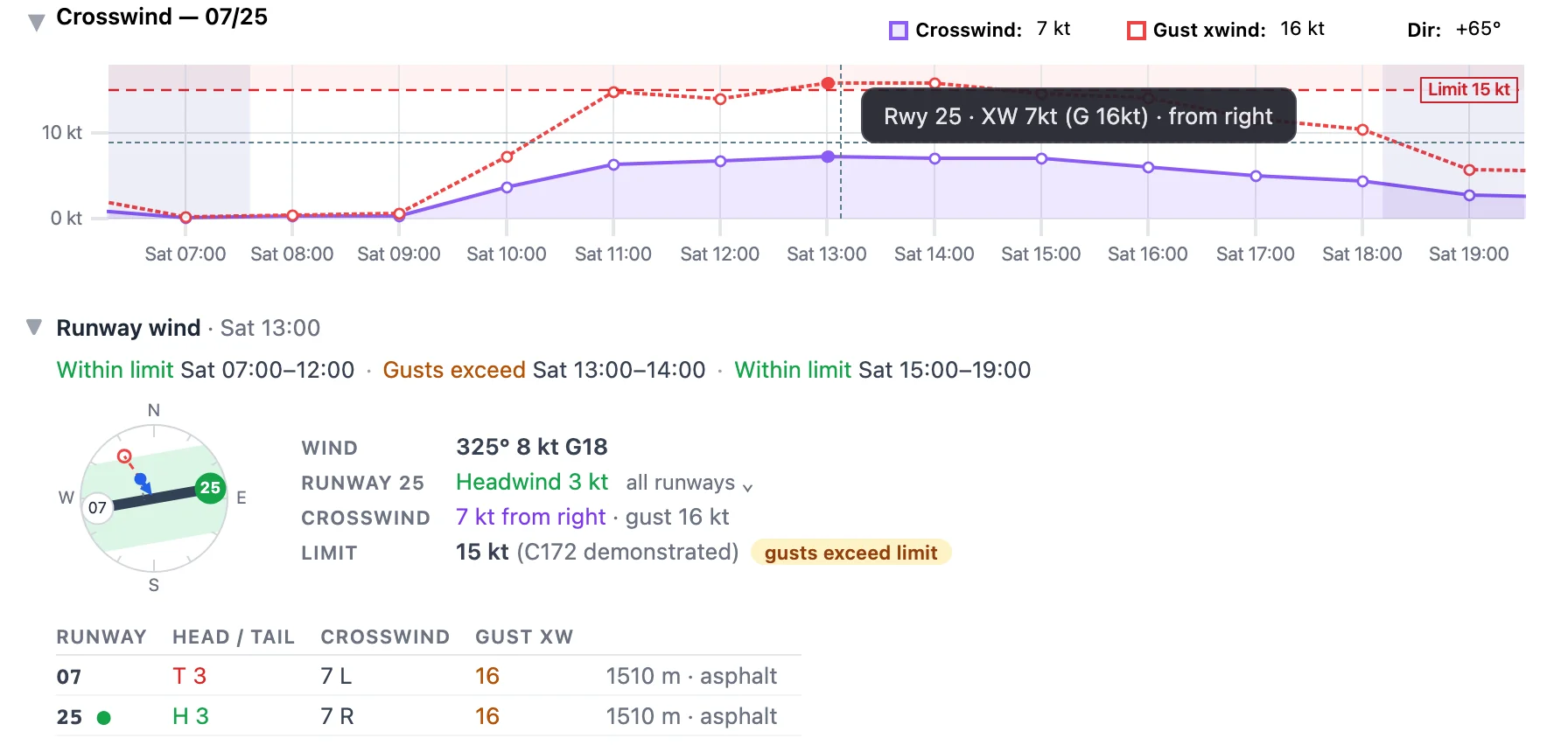
For airfields with runway data, ClearToFly computes crosswind and gust-crosswind at every forecast hour — the trigonometry you'd otherwise do mid-briefing. The panel header lists the field's runways (e.g. Crosswind — 07/25) and the chart plots the crosswind for the runway end you'd most likely be using: purple solid = crosswind, red dashed = gust crosswind.
That runway end is chosen for the whole forecast at once, the way a pilot or tower would, rather than hour by hour. Picking the end with the most headwind each hour sounds right, but in light or near-perpendicular wind it flips between ends on fractions of a knot — a runway change on paper that nobody would make. Instead:
- A tailwind of up to about 2 kt counts as "either end works" — the runway stays put.
- A change only happens when the other end gains enough headwind for long enough to be worth it — a genuine wind shift, not a wobble.
- A tailwind above 5 kt always forces the change.
- Calm hours keep the runway of the hours around them.
The runway in use is labelled at the left edge of the chart (e.g. RWY 25), and when it changes, an amber dashed line with a new label marks the hour — so the runway for any hour is the nearest label to its left, however far you pan or zoom. Because the choice looks at the whole day, the runway shown at 10:00 can depend on what the wind does in the afternoon — and may shift slightly when a new model run arrives.
Set your crosswind limit in the settings modal under My Aircraft: either pick your aircraft type (its POH maximum demonstrated crosswind is used) or enter a personal limit in whole knots — a personal limit wins over the aircraft's figure. With a limit set, the panel draws a dashed red Limit line and lightly shades everything above it, so hours where the purple or red line climbs into the shading are the ones to look at.
Runway wind
Directly under the crosswind chart sits a collapsible Runway wind section. It follows your cursor: hover (or tap) any hour on any panel and it shows that hour; move off the chart and it shows now. The heading line says which time you're looking at (e.g. Runway wind · Sat 14:00).
- Limit summary (when a limit is set) — one line that splits the visible range, from now onwards, into runs: Within limit 09:00–13:00 · Gusts exceed 13:00–16:00 · Exceeds 16:00–19:00. Gusts exceed means the steady crosswind is fine but the gust crosswind isn't; Exceeds means even the steady crosswind is above your limit. Pan or switch days and it updates with the view.
- Wind dial — a small compass with the runways drawn at their true heading, threshold labels on the approach side, and the selected runway end highlighted green. The blue arrow is the forecast wind, drawn from the direction it blows from, with its length proportional to speed; a red dashed extension shows the gust. A dotted line drops from the wind point onto the runway centreline: its length is the crosswind.
- Crosswind envelope (when a limit is set) — the green band on the dial covers every wind you can accept: one strip along each runway, as wide as your limit on either side. If the arrow tip sits inside the green, the crosswind for that runway is within your limit; if the gust extension pokes out, the gusts aren't. Fields with several runways get a wider, star-shaped envelope — that's the benefit of a crossing runway made visible.
-
Readout — forecast wind (e.g.
250° 14 kt G22), the selected runway with its headwind or tailwind component, crosswind with side (from left / from right) and gust crosswind, and your limit with a status pill: within limit (green), gusts exceed limit (amber) or exceeds limit (red). Without a limit, a link takes you straight to the settings. -
All runways — the toggle next to the runway row opens
a table of every runway end with head/tail wind (
H 12/T 4), crosswind with side, and gust crosswind; values over your limit are coloured. Useful when you'd pick a different runway than the one ClearToFly selected — a longer one, a paved one, or the one with the published circuit. - Observed wind — with Live data on and a recent METAR, the latest observed wind appears as a hollow orange arrow on the dial and an Observed row in the readout, so you can compare forecast and reality before you commit.
Cloud Cover
The workhorse panel — a vertical greyscale heatmap up to FL120 built from 28 model levels, so you see where the layers actually are, not just a single ceiling number. Darker = denser cloud at that altitude and time. Broken layers at 3,500 ft with clear air above versus a solid overcast up to 6,000 ft are two very different flying days, and this panel makes the difference visible.
This is materially more detail than most VFR pilots are used to. Common consumer weather apps and even most aviation weather sites reduce cloud to two or three summary numbers (low / mid / high cover, or a single ceiling height). Even DWD's own FlugWetter briefing text names categories of layers, not a continuous vertical profile. The 28-level heatmap above is closer to what a professional operator would build from a raw sounding — but reproduced automatically for every airfield, every hour, for the next five days. It's the single feature that most quickly changes how a VFR pilot decides "under, through, or over".
Three overlays on the same panel:
- Red dashed line — the ceiling (lowest broken/overcast layer). The single number you'd get from a text forecast.
- Cyan line — the 0 °C isotherm. Anywhere cloud crosses this line is a potential icing zone.
- Wind barbs in different colours at multiple altitudes, so you can pick a cruise altitude with the wind pattern in view.
Visibility
Solid cyan line = forecast horizontal surface visibility in km. The background is colour-banded so you can read the VFR/IFR category at a glance without checking the number:
- Green (8-20 km) — unrestricted VFR.
- Orange (5-8 km) — marginal VFR; legal but pay attention.
- Red (1-5 km) — not VFR.
- Dark red (< 1 km) — fog / severely obscured.
Dashed horizontal lines at 1, 5 and 8 km mark the exact thresholds.
Significant Weather
A one-row strip. Each hour that has a WMO WW code above 3 gets an emoji (☁️ mist, 🌦️ drizzle, 🌧️ rain, ❄️ snow, 🧊 freezing precip, ⛈️ thunderstorm) over a colour-coded background. Different phenomena get different colours — for example, ordinary rain shows as blue, freezing precipitation shows as magenta/pink (the airframe-icing hazard). Hover any hour for the exact WW code and human-readable label. Hours with no significant weather stay unshaded.
Precipitation
Stacked bars in mm per hour, split by type: Rain (blue), Snow (light blue) and Graupel (yellow). Height = intensity. On winter days the mix between the two blue tones matters — snow versus rain at the same rate is very different for runway conditions.
CAPE / CIN
Red = CAPE in J/kg (thunderstorm fuel). Blue = CIN (convective inhibition — the cap that keeps that fuel from firing). Horizontal reference bands label the CAPE regimes: Moderate, Strong, Severe, plus Weak cap / Strong cap for CIN. A day where CAPE climbs while CIN falls is a day where storms will fire — see CAPE learn page for how to combine the two.
Pressure
QNH curve in hPa. Useful for altimeter setting and for spotting fronts approaching (steady drop = incoming low; rapid rise behind a front). Orange dots = observed QNH where METAR provides it.
Sun Elevation
Filled yellow curve showing solar elevation angle through the forecast window, with civil-twilight and sunrise/sunset markers. For VFR pilots, civil twilight bounds when you can legally fly VFR without night rating. The dark shaded strip on the right shows the overnight period.
Reading the horizon
Hours 0–48 come from the high-resolution ICON-D2 model. Hours 49–120 are extended via ICON-EU (~7 km). The lower resolution is honest — a Day-4 forecast has meaningfully more uncertainty than a Day-1 one; use the extended horizon to spot trends, not to decide takeoff windows.

Reading the EDAZ example above
Look at the full-page screenshot. It's the current-day meteogram for EDAZ Schönhagen. Six things a VFR pilot can read at a glance:
- Temperature (panel 1): a mild day, ranging 12–22 °C. Orange dots hug the model curves closely — the forecast is well calibrated for today.
- Wind (panel 2): 5–15 kt from the north-east (031°–078° through the day), gusts to about 15 kt in the afternoon, then easing overnight. Format like 053° / 5G11 reads as "from 053° at 5 kt gusting 11 kt".
- Crosswind (panel 3, runway 07/25): stays under 5 kt all day — no runway-selection headache. Gust crosswind peaks around 9 kt in the morning.
- Cloud Cover (panel 4): layered greyscale from about FL020 up to the model top. The red dashed ceiling line touches down to roughly FL020 several times through the day — those are the marginal windows. The 0 °C isotherm (cyan) sits at FL100, above anything a piston GA aircraft would enter on this route.
- Visibility & Sig. Weather (panels 5–6): visibility is in the green band most of the day with a couple of dips into orange around mid-morning; the sig-wx strip shows two small blocks of precipitation (matching the visibility dips).
- CAPE / CIN (panel 8): flat in the Weak cap band — enough for scattered showers (which the sig-wx panel confirms) but nothing organised.
Decision: go, but plan around the mid-morning showers. Departure at 07:30 local or after 15:00 sidesteps both windows.
A second scenario — marginal morning departure
Suppose you're planning EDAZ → EDML tomorrow morning at 09:00Z. On the meteogram:
- Visibility & ceiling: visibility ~ 6 km (in the orange band) at 09:00, and the Cloud Cover panel's ceiling line dips to about 2,400 ft. Marginal but legal.
- Cloud structure: broken layer at 2,400 ft, clear air above about 4,500 ft. If terrain along the route is below 1,500 ft AGL, the layer isn't a hard blocker.
- Wind: 240° at 12 kt. Crosswind panel for runway 07/25 stays below 8 kt, and with a C172 set in My Aircraft the Runway wind summary reads Within limit all morning — fine for the aircraft.
- Precipitation: a small blue bar until 10:00Z, then dry. The marginal visibility is a moisture / shower issue, clearing after 10:00.
Decision: delay to 10:30Z and cross-check METAR (orange dots) before start-up.