AI Synopsis — how the weather briefing works
ClearToFly's Synopsis is an AI-generated aviation weather briefing — a written summary of the next five days across 14 European aviation zones, broken into morning / afternoon / evening timeblocks. It's not a weather forecast in itself: it's a language interpretation of the DWD ICON-D2 model data that already drives every other page on the site.
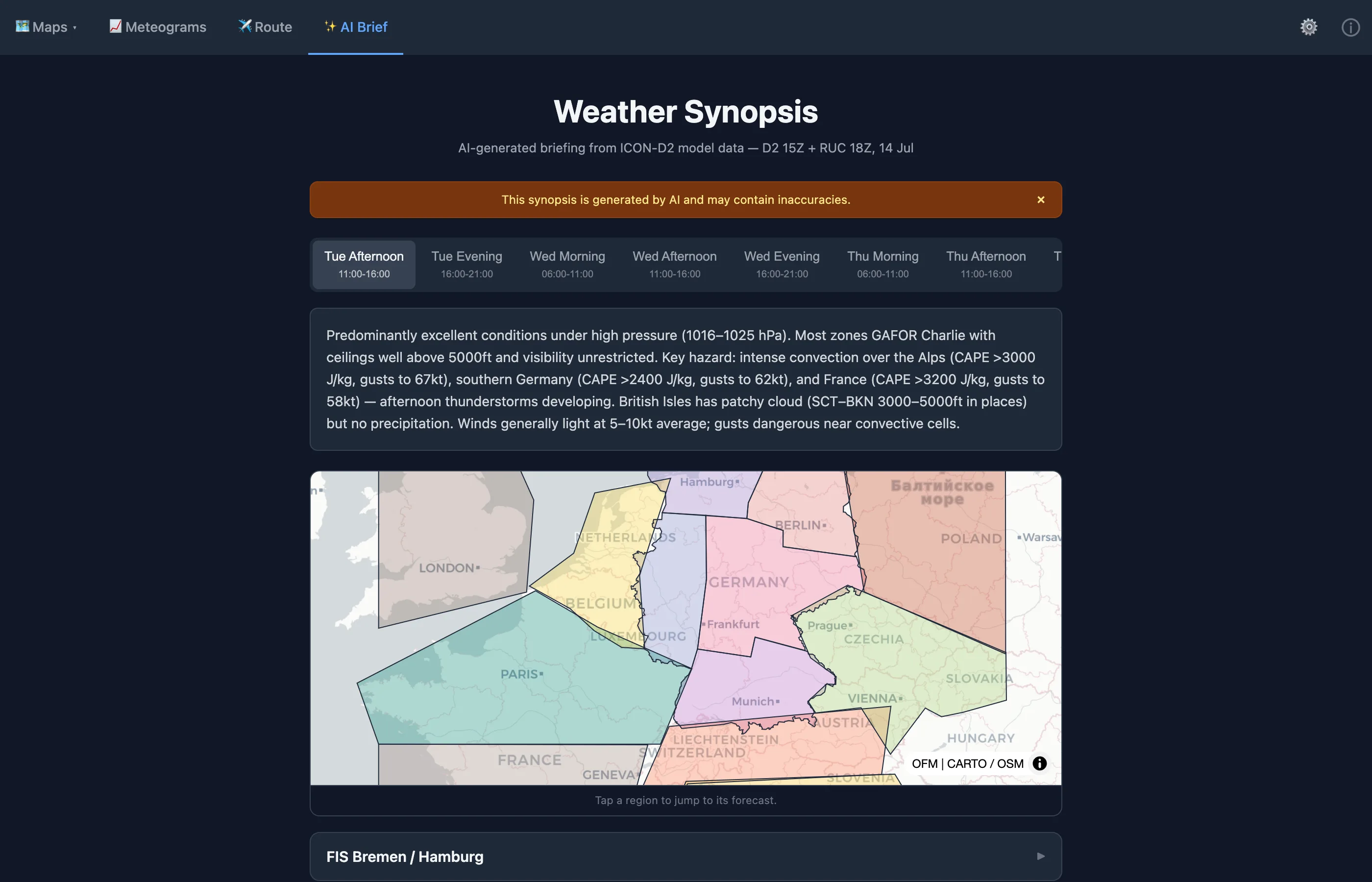
What's on the page
- Timeblock tabs across the top — 15 in total, covering the next five days as Morning (06:00–11:00), Afternoon (11:00–16:00), and Evening (16:00–21:00) blocks. The first block is the current one (based on the time of day you open the page); the last block is five days out. Tapping a tab switches every zone card below to that timeblock's synopsis.
- Zone map — a small overview of the 14 aviation zones. Tap a polygon to jump to that zone's card.
-
Zone cards, one per aviation zone (e.g.
FIS Bremen / Hamburg, FIS Berlin,
FIS Hannover / Frankfurt / Dresden, Alps,
Benelux, …). Each card carries:
- A one-paragraph AI-written synopsis for the selected timeblock.
- Aggregate model statistics: GAFOR change vs. previous run, percentage of the zone below 500 / 1,000 / 3,000 ft ceiling, percentage below 5 km visibility, temperature range, wind, and max CAPE.
How the zones are defined
ClearToFly divides the ICON-D2 coverage area into 14 hand-edited
aviation zones. The design principle: each zone should be
small enough that a single one-paragraph briefing is meaningful, and
large enough that a pilot flying anywhere inside it faces roughly the
same weather. Zones are stored as polygon rings in
synopsis_zones.json.
Germany — grouped by FIS sector
Inside Germany, the zones follow the German Flight Information Service (FIS) sectorisation. FIS is the frequency you're on for information / traffic advisories while flying VFR outside controlled airspace, and its sectorisation already tracks the natural weather geography reasonably well — coastal north, Alpine south-east, industrialised west, etc. Using FIS boundaries also means the zone names on the map match the frequency the pilot is already thinking about.
Germany splits into five FIS-grouped zones:
- FIS Bremen / Hamburg — the North Sea and Baltic coasts and their hinterland. Distinct weather: often the marine influence dominates (fog, low stratus, gusty westerlies).
- FIS Berlin — the Berlin/Brandenburg area including the classic GA airfields around the capital (EDDB, EDDT-former, EDAZ, EDBH, …).
- FIS Hannover / Frankfurt / Dresden — the broad central belt from Lower Saxony through Hesse to Saxony. Grouped because three FIS sectors share a similar weather character (continental, moderately elevated).
- FIS Düsseldorf / Saarbrücken — the industrialised west and Rhine valley up to the Saarland. Different again from central Germany — closer to Atlantic influence.
- FIS Stuttgart / Nürnberg / München — the whole south down to the Alps. Grouped because the three southern FIS sectors face similar frontal-approach patterns; the Alps themselves are broken out separately (below).
Where a natural weather boundary doesn't line up with a single FIS sector, we group adjacent sectors — thus "Hannover / Frankfurt / Dresden" as one zone rather than three near-identical briefings. This is the "clusters of FIS" pattern: the German zones are FIS-shaped, but not exactly one-to-one.
Outside Germany
The other nine zones follow national or physical boundaries rather than FIS structure:
- Alps — the mountain arc itself (Austrian Alps, Bavarian Alps, Swiss Alps, northern Italy). Broken out because Alpine VFR conditions differ so materially from surrounding flatland.
- Northern France, Southern France — split roughly at the latitude where the Massif Central and the Rhône corridor become the dominant terrain.
- Benelux — Belgium, Netherlands, Luxembourg. Coastal North Sea character with strong maritime influence.
- Denmark & S. Sweden — the southern Scandinavian VFR region.
- Czech, Slovakia & Austria (flatlands) — the eastern-Central European plain, excluding the Alpine portion of Austria which sits in the Alps zone.
- Poland, N. Italy & Adriatic, British Isles — the remaining coverage-area edges.
Zone order in the JSON matters: German entries come first so that point-in-polygon lookups for a German airfield resolve to a German zone rather than an overlapping neighbour polygon.
How stats are sampled inside a zone
For each zone × timeblock, ClearToFly's pipeline needs to reduce a ~2.1 km grid of ICON-D2 forecast values (potentially tens of thousands of grid points inside a zone, over 3–5 hours of the timeblock) into a small set of numbers the LLM can reason about. It does that in three steps:
- Build a boolean mask over the model grid. For each zone, the pipeline runs a point-in-polygon test on every ICON-D2 grid cell inside the zone's bounding box (a cheap pre-filter), producing a mask array the same shape as the model grid: True for cells inside the polygon, False outside. The mask is computed once at pipeline-start and reused for every hour of the run.
- Apply the mask to each hourly forecast field. Ceiling, visibility, temperature, wind components, CAPE and precipitation are all pulled from the GRIB output for each hour in the timeblock (typically 5 hours per block), and the mask is applied — leaving only the values inside the zone polygon, during the timeblock.
- Aggregate. The masked pixels are then summarised: percentages below thresholds (ceiling < 500 / 1,000 / 3,000 ft, visibility < 5 km), min / max temperature, mean wind, max CAPE. These are the numbers shown on each zone card.
The aggregation is coverage-aware. "18% of the zone below 3,000 ft ceiling" is a genuine "one-fifth of your zone is Charlie" signal, not "a single grid point is Charlie so let's warn about it". Similarly, "max CAPE 1,800 J/kg" reflects the worst spot in the zone across the timeblock — if any patch is thunderstorm-prone, the number surfaces it.
Extended-range zones (up to +120 h) use the same approach but on the coarser ICON-EU (~7 km) grid — the pipeline builds a second set of masks for the EU grid resolution. That's why Day-4 and Day-5 stats are still meaningful, even though the raw resolution drops.
How the synopsis is generated
The pipeline is deliberate, not "throw model data at ChatGPT":
- Aggregate. The zone-masked stats described above (ceiling / visibility / temperature / wind / CAPE / precipitation percentages and ranges) are computed for each zone × timeblock. The same stats appear as the numeric rows on the zone card.
- Diff. The pipeline compares each zone × timeblock to the previous model run and flags meaningful changes — a GAFOR category shift, a ceiling drop, an incoming shower window. These changes surface as the coloured chips on the zone card (degraded in red, improved in green).
- Reason. The aggregated stats plus the diff are packaged into a structured prompt and sent to an LLM. The prompt is aviation-specific: it asks the model to write a VFR pilot's summary of the timeblock, cross-reference ceiling / visibility / wind against typical VFR minima, and flag icing, thunderstorm, and wind-shear risks explicitly.
-
Serve. The written synopses + the raw stats are
written to
synopsis.jsonin S3, then rendered by the/synopsisroute on request. The pipeline runs once per day, triggered when the ICON-EU 12Z run lands — that's the run that carries the full 5-day (120 h) horizon the synopsis needs. So the synopsis available in the morning is always fresh from the previous afternoon's ICON-EU 12Z run; it does not update on the shorter ICON-D2 3-hourly cadence.
Synoptic analysis — what the synopsis now accounts for
Before writing any prose, the pipeline computes a deterministic, grid-based synoptic analysis of the full ICON-D2/EU domain. This analysis is derived algorithmically from the model grid — no LLM is involved in deriving the facts. The structured findings are injected into the prompt, and the AI narrates what the numbers already say.
The synoptic analysis covers seven elements:
Pressure centres
The pipeline detects mean-sea-level pressure highs and lows: their position (lat/lon), central pressure (hPa), and pressure-gradient radius. The LLM receives location and strength — "a 1,016 hPa high centred over Denmark, a 998 hPa low over Iceland" — rather than a vague "high pressure dominates". This is a model read-out, not a subjective synoptic chart interpretation.
Flow aloft and gradient tightness
500 hPa wind vectors are summarised per region across nine sub-domains. Each region gets a dominant direction and mean speed. Gradient tightness — the spatial density of 500 hPa height contours — is flagged as slack, moderate, or tight. Tight gradients mean strong, consistent flow and fast-moving frontal systems; slack gradients signal blocked, stagnant patterns where fog and radiation effects dominate.
Upper trough and ridge pattern
The 500 hPa height field is scanned for troughs (northward-displaced cold air, negative curvature) and ridges (southward-displaced warm air, positive curvature). Trough position drives rain and instability onset; ridge position drives fine-weather windows. The pipeline reports the axis position so the synopsis can write "a trough over France will push eastward overnight" rather than "conditions may deteriorate".
Alpine föhn
Föhn is detected from two signals: the Bozen–München pressure difference (a cross-Alpine gradient >4 hPa indicates north föhn conditions) and southerly crest flow at 700 hPa over the Alpine axis. When both signals are present the synopsis explicitly notes föhn and distinguishes its effects by zone: Alpine valleys get the warm, dry, gusty descent flow while the Alpine foreland (FIS München / Stuttgart, Czech foothills) sees the föhn shadow — often bright south of the Alps while Bavaria is under high cloud or a föhn wall. The Alps zone and FIS München zone cards will describe the same event differently.
Blocking and Vb cyclone tracks
Two high-impact pattern types are computed and reported only when clearly present — confidence-gated, so they stay silent when the signal is ambiguous:
- Blocking (omega or Rex pattern): a persistent high anchored over Scandinavia or Eastern Europe with a cut-off low to its south. Blocking means systems stall — slow-moving fronts, multi-day fog spells, or prolonged heat. The synopsis will note the block when it is dominant.
- Vb cyclone track: a low-pressure system tracking from the Gulf of Genoa northeastward through Bosnia, Slovakia, and into Poland. Vb lows are responsible for the most extreme multi-day precipitation events in the Alps–Carpathian arc. When a Vb-type track is forecast the synopsis names it and identifies the affected zones.
Absence from the synopsis means the diagnostic was not decisive — not that the pattern is absent. These are model-forecast patterns, not climatological composites.
Flow regime (Grosswetterlage-style)
The large-scale circulation is classified into one of the canonical Central European flow regimes — similar in spirit to the DWD Großwetterlagen classification but derived directly from the current model run. The synopsis frames this as "resembles" (e.g. "the pattern resembles a southwest-flow Großwetterlage — warm, moist, frontal activity from the Atlantic") to give experienced pilots a quick contextual anchor without overstating precision.
Convective character
Domain-wide CAPE and deep-layer shear (0–6 km, the same field shown on the convection map) are combined to classify the expected storm character:
- Airmass / isolated: CAPE present, shear below 20 kt. Scattered pop-up cells; short-lived, slow-moving, avoidable.
- Multicell: moderate CAPE with shear 20–35 kt. Regenerating clusters; bow echoes and gusty outflows are likely. Give cells a wider berth.
- Organised / supercell potential: sufficient CAPE with shear above 35 kt. Squall lines, rotating supercells, large hail. When the synopsis mentions "organised convection" or "supercell potential", treat the affected zones as a hard no-go until conditions pass.
Storm motion (direction and speed derived from the mean wind through the cloud-bearing layer) is included, so the LLM can write "cells expected to move north-northeast at 35 kt" rather than a static description.
How to read a zone card
- Zone name — the FIS sector the zone corresponds to. ClearToFly's zones follow the German FIS sectorisation for German airspace, plus separate zones for Benelux, Alps, Czech / Slovakia / Austria, and Denmark / Sweden.
- GAFOR change chip — red degraded or green improved chips flag zones where the current run differs materially from the previous model run. A degraded chip on your planned zone × timeblock is a signal to look harder at the underlying maps.
- AI synopsis paragraph — one paragraph, written to the selected timeblock. Read this first for the shape of the day.
- Ceiling % — the fraction of the zone with ceiling below 500, 1,000, and 3,000 ft during the timeblock. High percentages at 3,000 ft = widespread marginal VFR; high at 500 ft = the low pressure has arrived.
- Visibility % — fraction of the zone with visibility below 5 km. A rising number over consecutive timeblocks tells you deteriorating conditions.
- Temperature range — min-to-max °C during the block. Useful for density altitude, icing, and morning-stratus burn-off assessment.
- Wind — the dominant surface wind direction / speed during the block. When the AI paragraph says "gusty westerly", this row confirms it in numbers.
- Max CAPE — highest CAPE value in the zone during the block. Use with the convection learn page: 500 J/kg = airmass storms possible, 1,500 J/kg = organised storms likely.
What the AI is good at (and what it isn't)
The AI's strength is synthesis: turning a dozen numeric stats into a two-sentence English summary a pilot can read in seconds. It's much better than a text-only forecaster at consistently mentioning every relevant hazard, because it's given every stat every time and prompted to flag specific risks.
Its weakness is calibration. The AI has no independent view of the atmosphere — everything it says traces back to the ICON-D2 grid statistics it was fed. If the model is wrong (persistent fog, a rogue overnight cell), the AI's summary will be wrong the same way. Two rules for reading the synopsis:
- Trust the numbers over the prose. When the AI's paragraph says "unsettled" but the ceiling percentages are all zero and CAPE is 100 J/kg, believe the numbers.
- Cross-check against current observations close to flight time. The synopsis is a briefing tool, not a replacement for a current METAR / TAF / DWD FlugWetter check.
Route Brief — the per-route AI
A related feature: the Route Planner and cross-section pages both offer an AI Route Brief. Where the Synopsis is zone-scoped, the Route Brief is route-scoped: same LLM engine, but the input is your specific waypoint list, cross-section stats, and optional aircraft type. Output is a formatted PDF sent to your email, usually within a minute or two.
The Route Brief covers the same categories as a zone Synopsis (conditions, hazards, recommended cruise altitude) but at the resolution of a specific flight. Both use the same underlying ICON-D2 data.